The Feature
COUSE
COUSE
Designing how users discover and connect to financial data
Before the Marketplace, finding a new data provider meant demos, sales calls, and long integration work before anyone could even see if the data was useful. The Apps Marketplace was built to close that gap: instead of browsing a static catalog or building an integration from scratch, analysts can open a live app, explore real data, and decide in minutes whether it's worth connecting to.

My role
I worked on the end-to-end design of the Marketplace experience, from early flows to the final screens. My focus was on three very different users: the analyst discovering and trying new data inside the Workspace, the data vendor submitting and managing their own app, and the OpenBB admin reviewing submissions and controlling who gets access to publish.
I was responsible for mapping all three journeys, defining the key screens, and designing every state of the submission process, from draft to approval.

Discovery
Personas
Three audiences needed different things from the same product. Analysts wanted speed: open an app, see real data, decide fast, with no sales process in the way. Vendors wanted independence: a way to submit, update, and manage their own app without waiting on the OpenBB team for every step. Admins needed control: a way to review submissions and manage who's allowed to publish, without turning quality checks into a bottleneck. Solving all three meant designing three connected but distinct flows inside the same product.
Flow 1: Analyst
Discovering and connecting to an app
The main design goal here was removing friction at every step. If an analyst has to wait, fill out a form, or talk to a salesperson before seeing real data, they lose interest. The flow was built so the first meaningful interaction with a new data source happens in seconds, not days.
User navigates to the "Apps" page of OpenBB Workspace and selects the "Apps Marketplace" tab alongside "My Apps".
System displays a grid of vendor app cards, grouped or filterable by category.


User clicks 'Connect App' on the app card.
Opens a modal overlay with vendor name, logo, long description, authentication status, available widgets, sample AI prompts, and 2–4 product screenshots.

User reviews the information, decides to try the app and connect it.


After connecting the app, the user navigates to the "My Apps" tab alongside "Marketplace" and clicks the (⋮) menu that appears on connected cards.
Menu presents three actions: Open App, Disconnect App, and Rate App.

If Open App → system opens the dashboard with its widgets, letting the user work with live data.

If Disconnect App → system removes app, reverting the card's status (back to "Connect App"), while the card remains visible in the Marketplace for future reconnection.

If Rate App → system opens a rating/feedback modal, letting the user submit a score or comment on the vendor app, feeding vendor-side quality signals.

Flow 2: Vendor
Submitting an app
Developer submits their app by connecting it via the backend.
The app appears on the Apps page, initially just as a regular connected app.

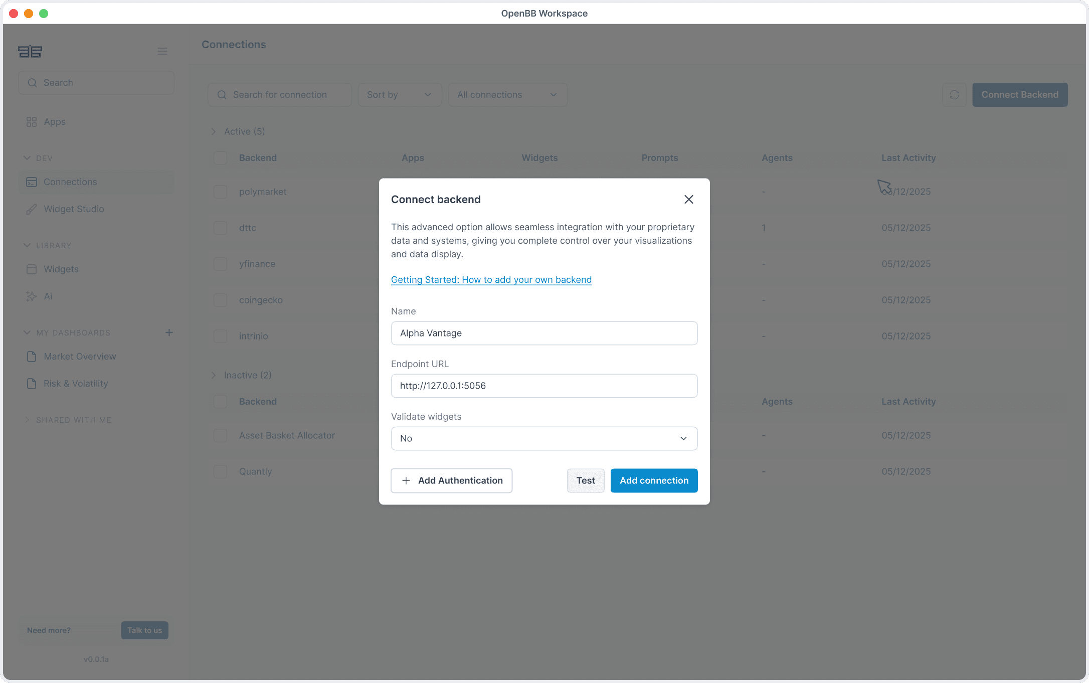
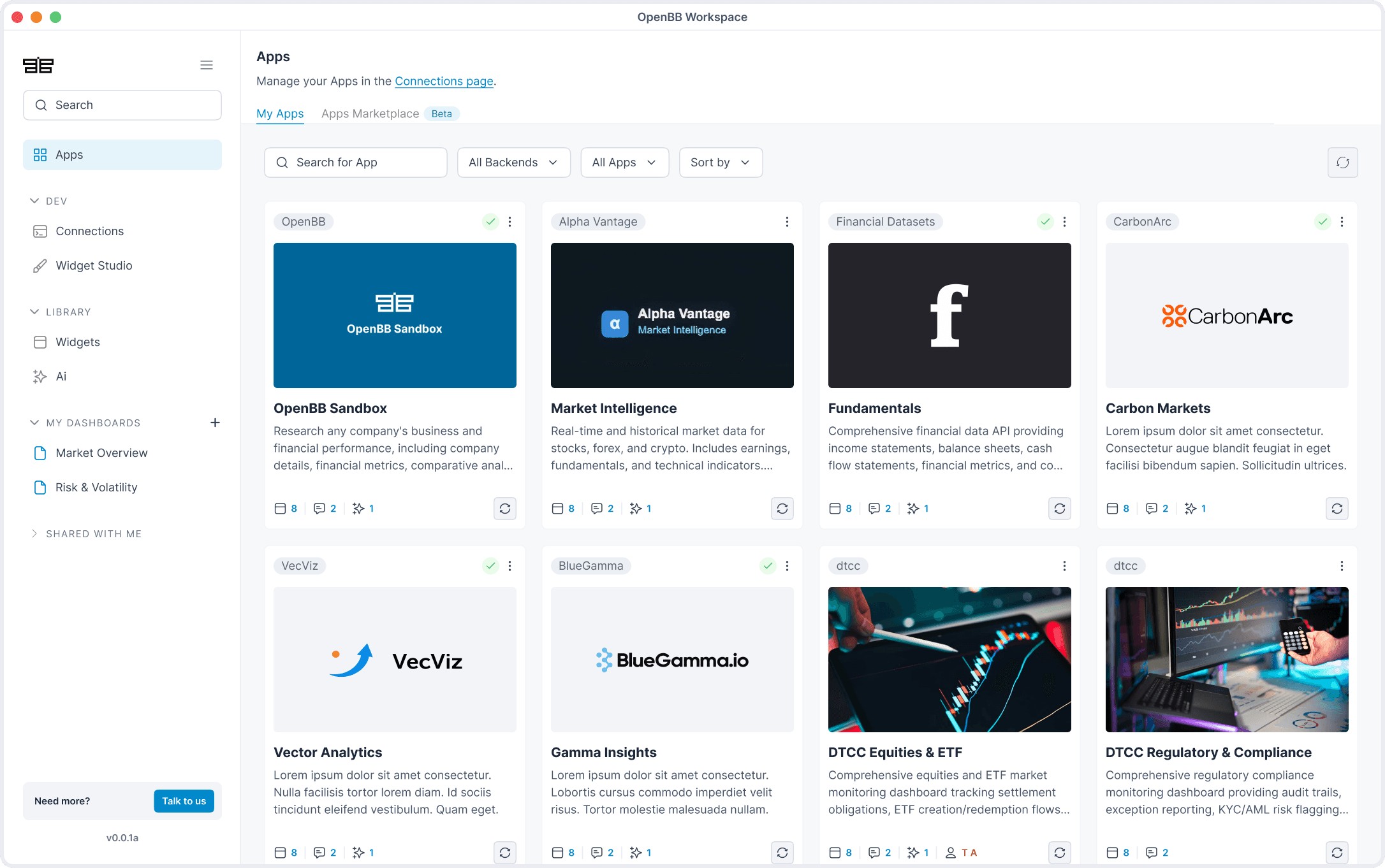
Developer opens the three-dot menu on the app card and clicks “Submit to Marketplace”.
It opens a modal with three sections to fill in: Vendor Profile, App Info, and App Preview (a live preview of how the listing will look once published).


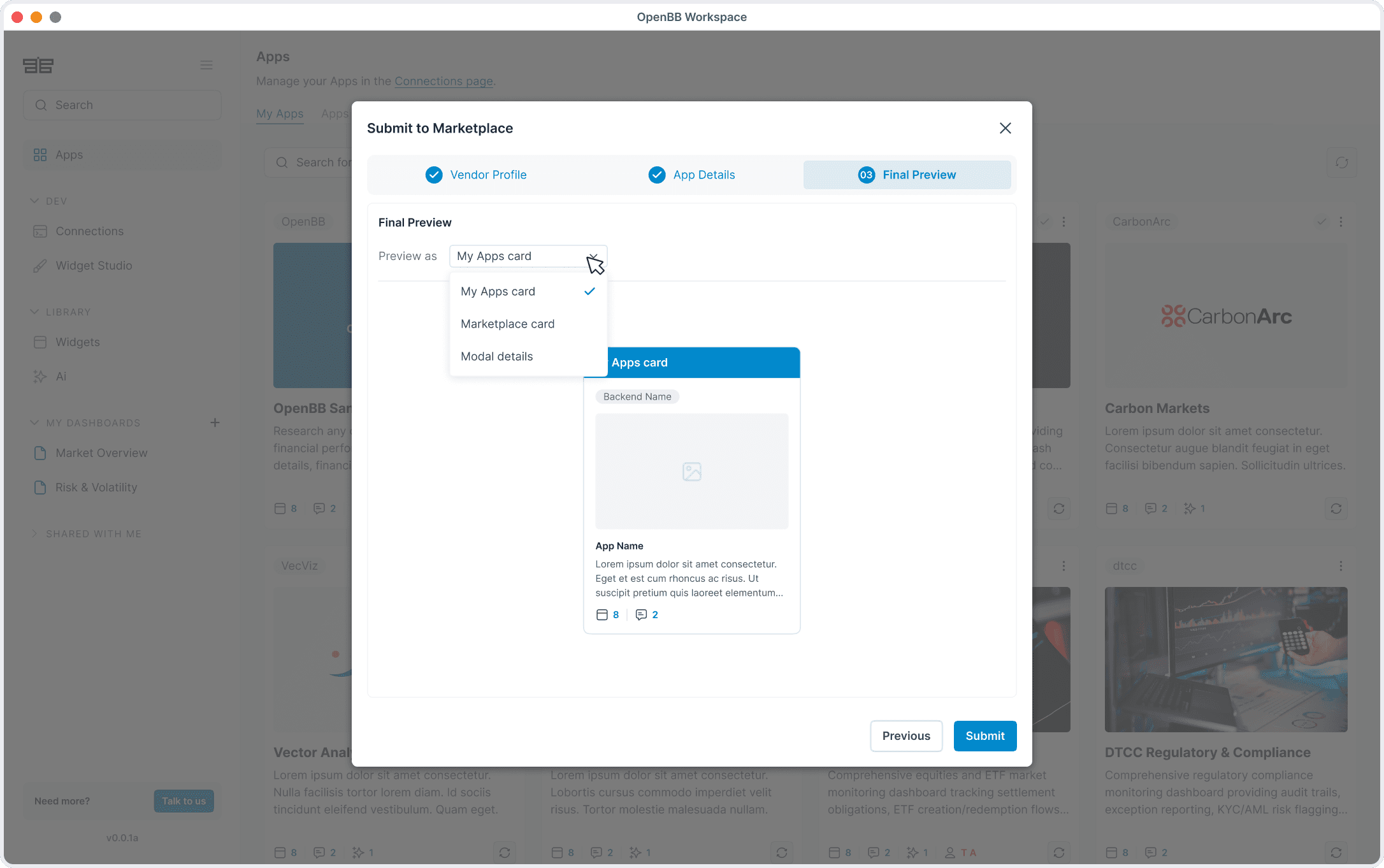
Developer submits the form. The app is now moved into a tab labeled “Reviewing.”
Status:Reviewing → the app is being reviewing manually by the OpenBB team.

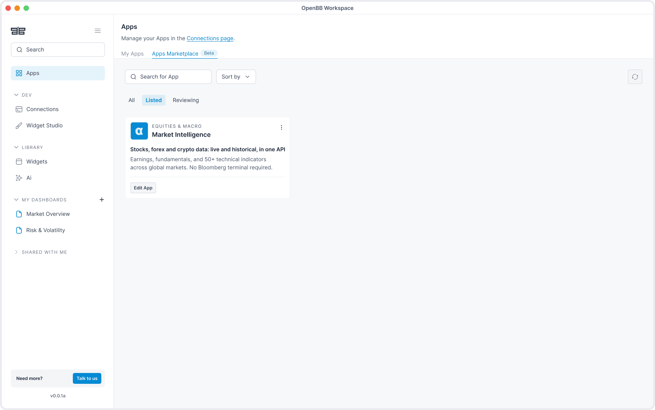
Approved → the app is added to the Marketplace and becomes publicly visible.
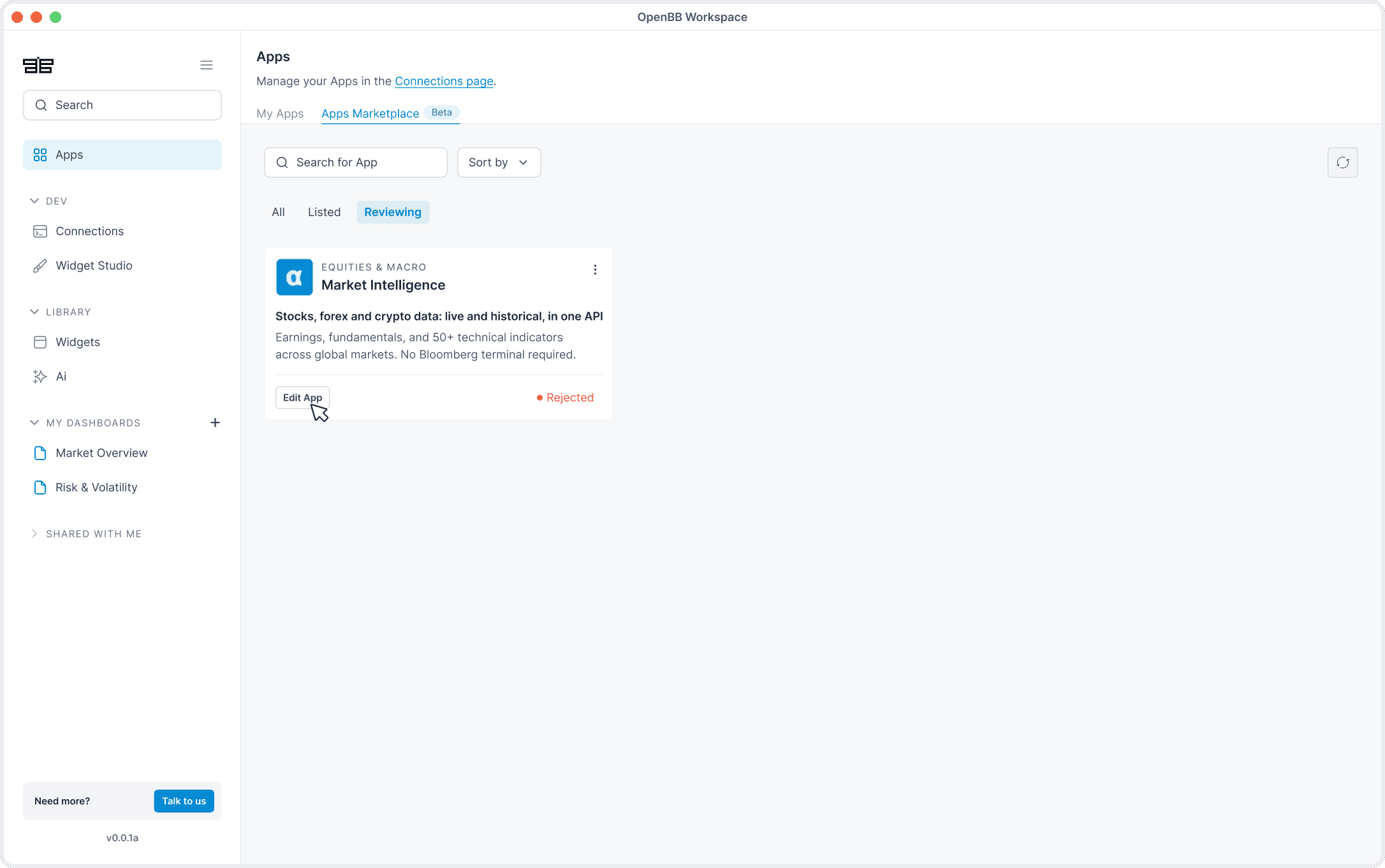
Rejected → the app is rejected and the user receives feedback to improve it.

Flow 3: Admin
Reviewing submissions
Before an app goes live, someone from the OpenBB team actually opens it and tries it out, checking that the screenshots match reality, the description isn't misleading, and nothing breaks the platform's rules. It's the one part of this whole system that isn't automated on purpose. A bad approval doesn't just affect one submission, it affects every analyst who opens that app afterward, so this step stays manual and slow by design rather than something we tried to speed up.
Admin opens the Admin Portal, where there is a dedicated Marketplace Management section where all the app submissions are listed.

Admin opens a submission to review it in detail.


Reject → the app's status changes to "Rejected," and the admin adds a note explaining what needs to be improved; this note is what the developer sees when they reopen their submission modal.

Outcome
User Engagement
Cards looked exactly like the ones in "My apps", so nothing stood out or invited users to explore further.
Covers had strong visual impact, roughly 50% of the card, but were mostly prints of the apps without any context.
Long descriptions got cut off mid-thought, so users never quickly understood what they'd gain from clicking.

Removing the covers let the layout feel more like a marketplace, something more familiar to what users are used to.
Filtering by Rates & Macro, Equities, Flow & options, Data, and more, gave users a clearer way to navigate and discover.
Cut down to one or two punchy lines that quickly tell the user what the app does and why it's useful.

Results